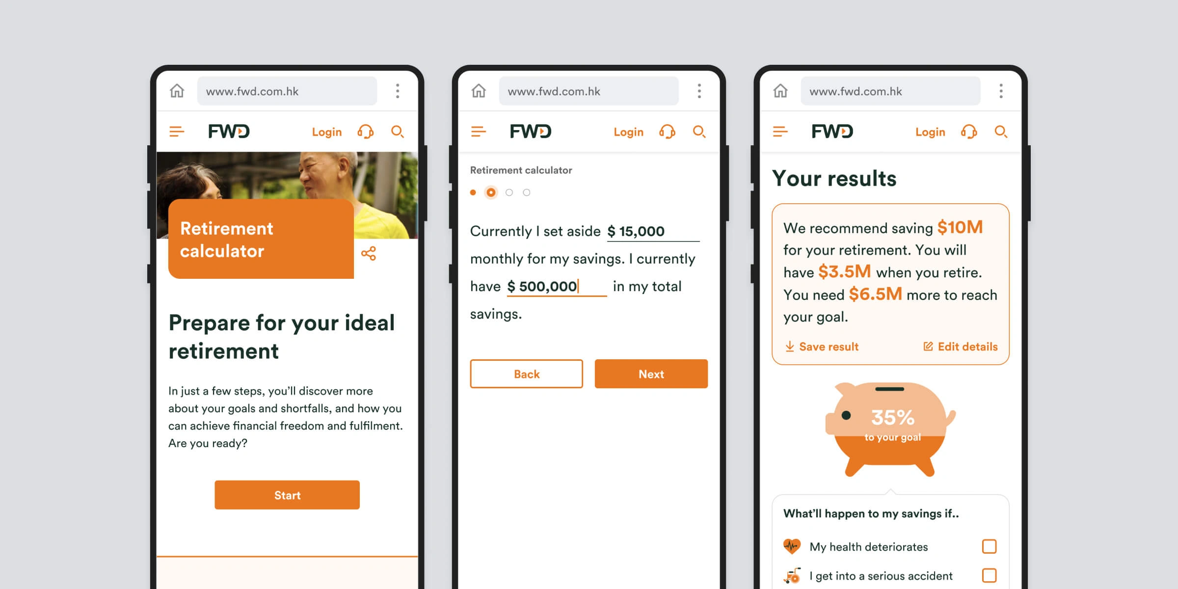
Retirement & protection gap calculator
Engaging calculator & lead generator
Overview
Our Group Digital team at FWD (the team that I belong to) proposed to have a new lead generation tool. A retirement calculator that can identify protection gaps for customers, and capture leads for agents.
My role
As the sole designer for this project, my role was to research, ideate, design the UI/UX and facilitate user testing sessions.
Goal
Our long term goal for this project is to help people to holistically understand their financial and protection gaps and in turn create trust with FWD and generate leads.
In order to reach our long term goals, we had to ask ourselves what challenges we wanted to solve. We came up with 3:
- Will people find our calculator useful and engaging?
- Will they understand their financial and protection gaps?
- Will we be able to reach new customers?

The process
The design process I took for this project is a modified and condensed version of the Design Sprint process; Get quantitative data, create "How Might We" based on data, map out and target a problem area we want to solve, sketch and prototype, and test our assumptions with users.
Getting quantitative data
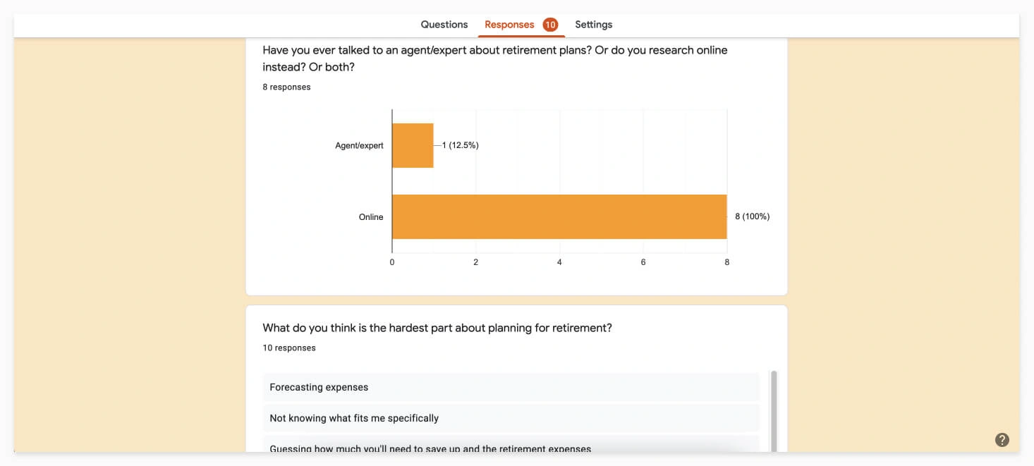
I first brainstormed some questions I wanted to ask and then created a google from and passed it around to get some quantitative data to get some quick direction on how to start the design.
Here are some interesting findings:
- 80% of people have thought about retiremnt plans, while 20% have not.
- When getting financial advice, everyone just search online while 10% have actually talked to an agent/expert.
- The hardest part about planning for retirement is they don't know where to start and forecasting expenses.
- 50% have investments (besides MPF) that may contribute to their retirement, while 50% did not.
- Pretty much everyone have thought about how something bad may happen to them that will affect their livelyhood, but are not prepared for it.
- 50% consider themselves financially saavy, while the other half does not.
Map
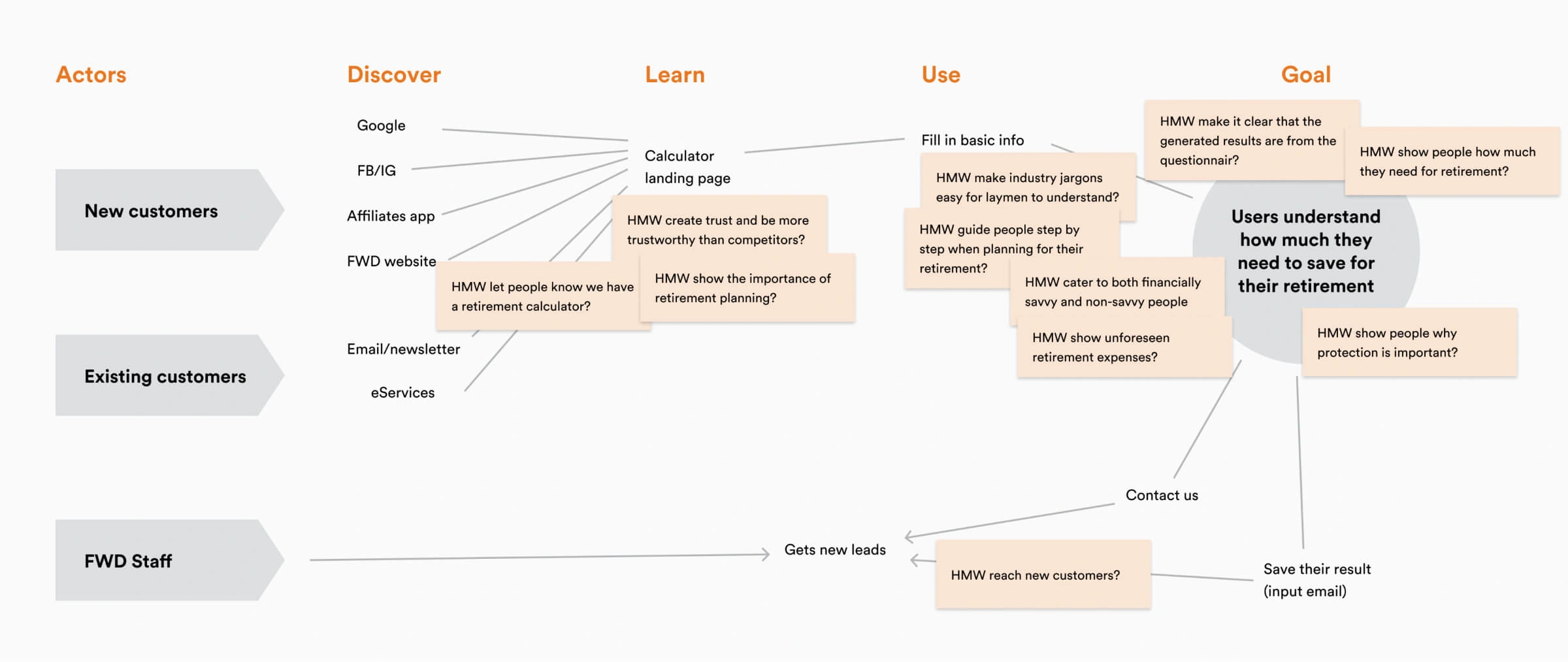
After getting the results from the survey, I then created "How Might We"s based on the data collected. I then mapped out the customer's and agent's journey and see how it all connected, then stuck the "How Might We"s on the map. Then with my PM, we decided where to target the area that we want to solve on the map. This gives us a better idea on where to focus our efforts for faster design iterations.
Sketch and prototype
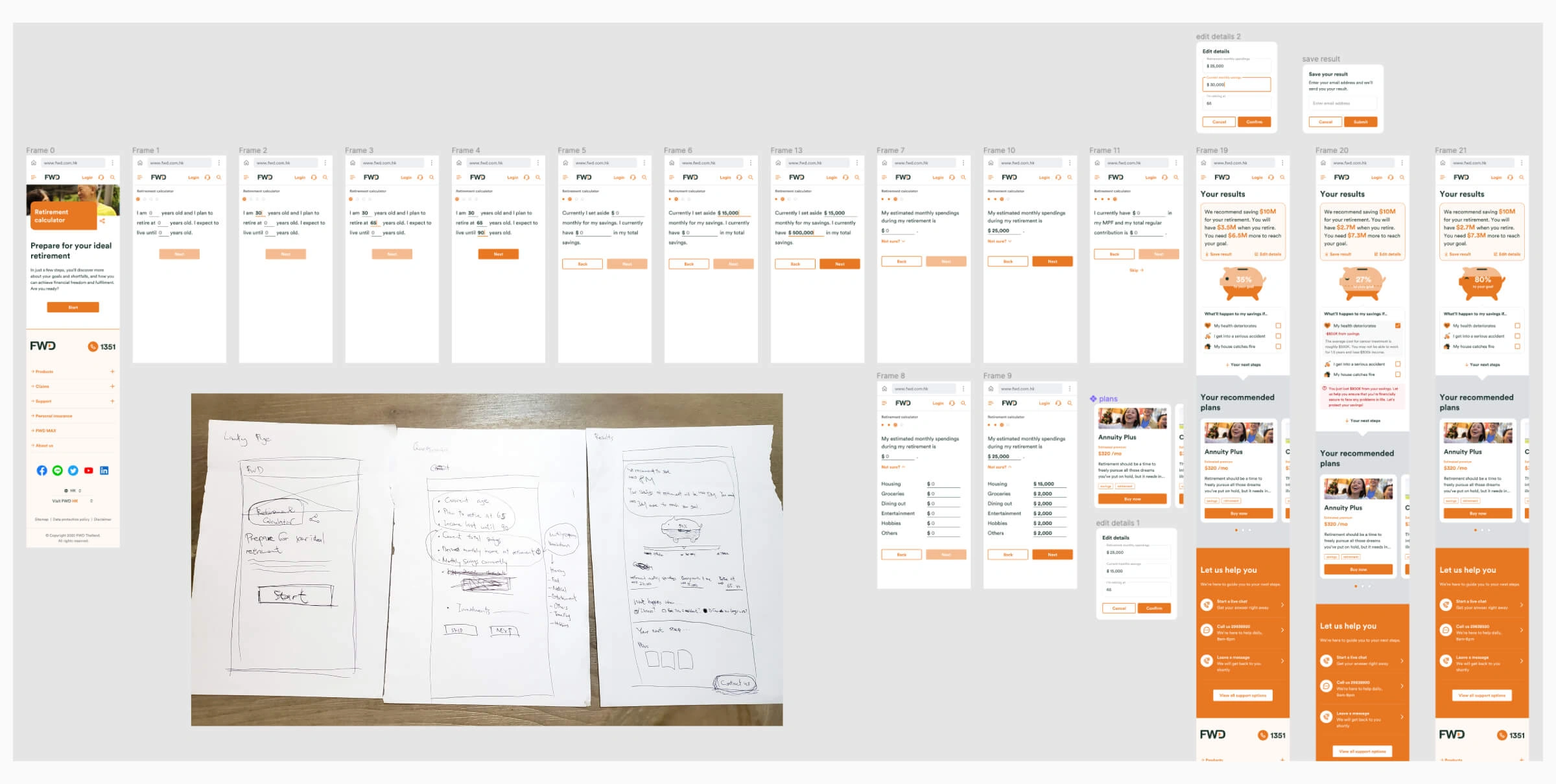
We sketched out some ideas and mocked up a prototype on Figma to test with users. The flow is as follows: The user begins at the retirement calculator landing page, then fills in their age and basic financial info (investments is an optional step), then we show them their financial and protection gaps, as well as recommended plans. We're also able to capture the leads on this page.
Feel free to check out the protoype.
Validating the design
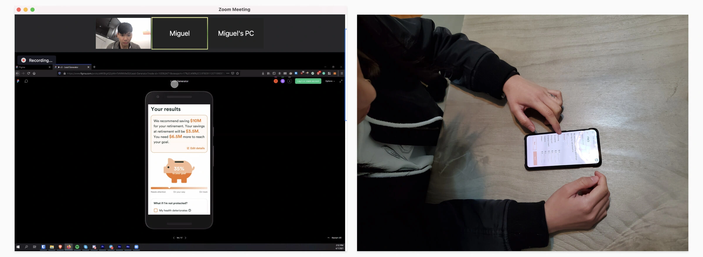
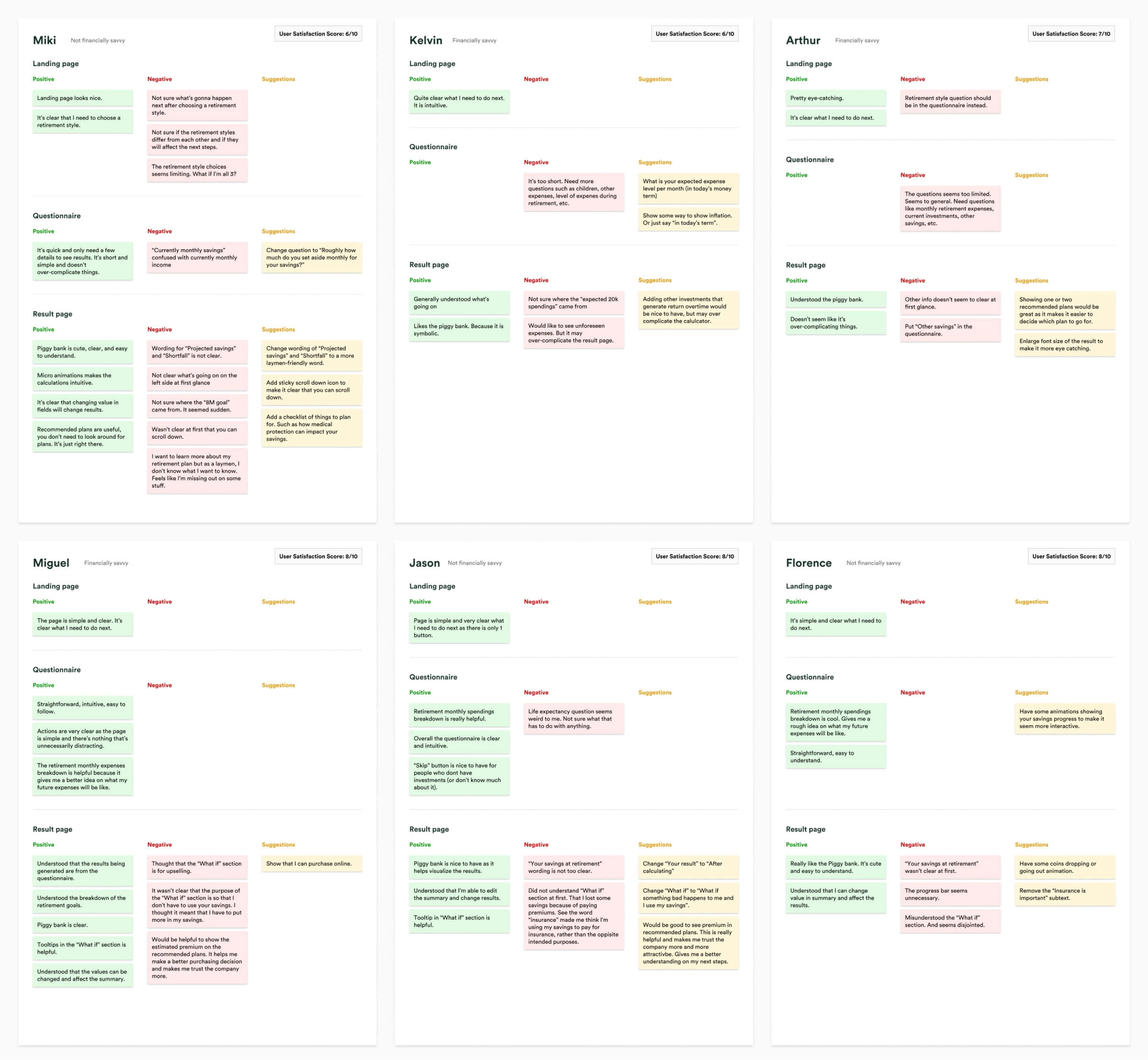
I tested the prototype with several people, both in person and remotely. They gave valuable insights and suggestions, and the design improved significantly after each iteration. As the facilitator, I captured the testers and reviewed the videos later as I had no extra support from other people. This helps me focus more on the testers and the tasks at hand. After analysing the videos, I documented their insights identified any patterns, and itereated the designs from there.
There were 3 rounds of user testing in total, with each round having 4-5 testers. You can check out some of the insights below.
Conclusion
With not much resources allocated to this project, I was forced to be creative with how I conduct my research and process and also validating my design. Although the prototype was well recieved by testers, teammates and managers, we had to hold off on pursuing this project as the wider team had other priorities and resource contraints. Nevertheless, I had fun and learned a lot working on this project.