FWD - eCommerce HK
Facilitating the research & ideation phase
Overview
There has been decisions from higher ups to rebrand the FWD websites across all countries as there is a huge inconsistency with the UX and UI. They wanted to unify the experience, starting with Hong Kong as a base. Me and 2 other designers have been tasked to help out on this initiative.
Goal
The goal of this project is to redesign Hong Kong's website to use as a base and roll it out to other markets. The website has to be intuitive to navigate and easy to understand for customers who are not "insurance savvy", guiding them through an optimized conversion funnel to, well, convert them into sales.
My role
My role was to facilitate the research and ideation phase of this project, along with 2 other designers. Unfortunately I had to be pulled out from this project after the research and ideation phase as I was required to help out on another project. Nevertheless I still want to show you the process as I think it's interesting and I learned a lot.
The process
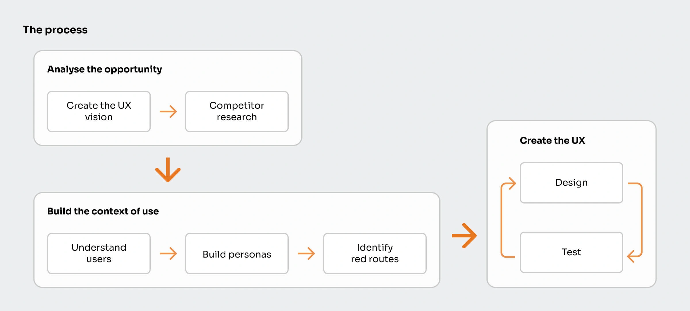
The typical Design Thinking process was used for this project; Create the UX vision, competitor research, empathize and understand users, define user personas, identify red routes, design ideation, and testing.
Competitor research
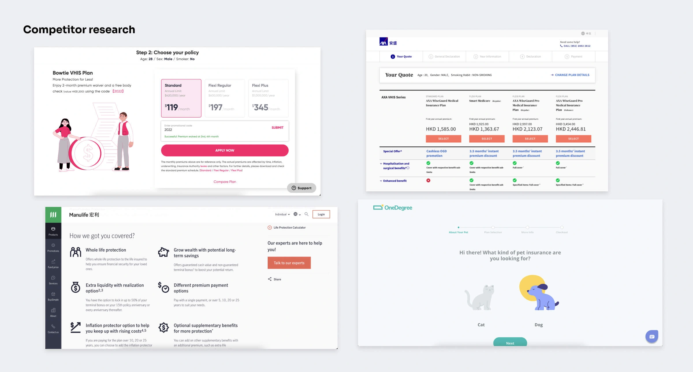
First we analyised our competitors' strengths and weaknesses in their eCommerce presence and see what we can leverage from our findings. Unsurprisingly, startups like Bowtie and OneDegree trumps the more well-established insurance giants (not gonna name any names) in their UX.
Here are some key findings:
- Insurance products should be easy to understand and digestable to anyone.
- There should be no ambiguity in any step. Insurance is an already complex topic to begin with.
- Conversion funnel should be optimized and have as little steps as possible to prevent dropoffs.
Understanding our users
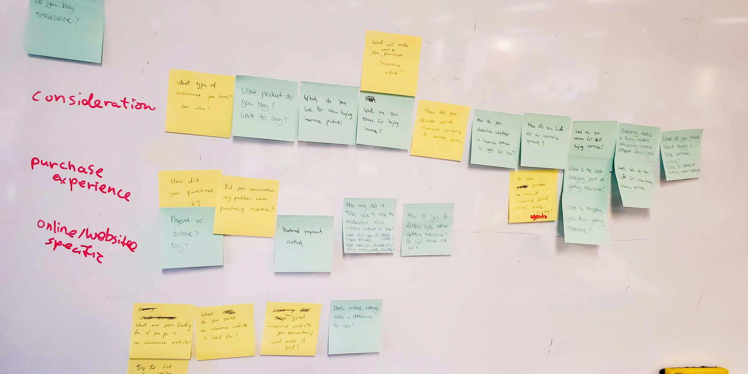
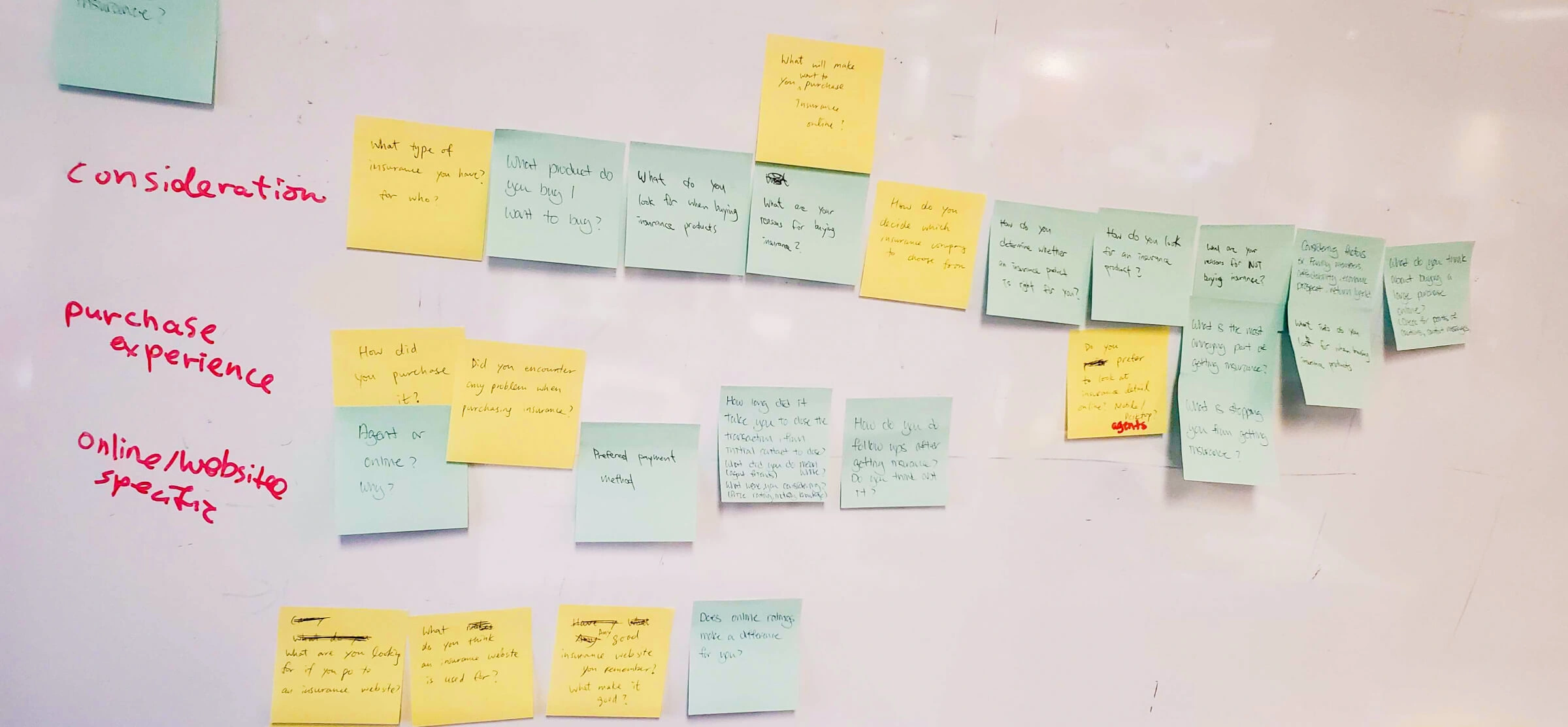
Before we interviewed our users, we first brainstormed questions and things that we'd like to know from them. We put our ideas on sticky notes and stuck them on a white board to create an affinity diagram. Then it was time to interview them and get some qualitative research. We interviewed 9 users in total both in person and remotely, to help us understand their thoughts and considerations when it comes to learning and buying insurance.
Here are some key things we learned from them:
- The process is confusing , tedious and sometimes even daunting for a lot of people.
- People tend to rely on agents when they want to learn more or buy insurance because they takes a lot of the hassle away.
- People are willing to buy online because they're scared of "salesy" agents. The problem is they don't have the confidence to do so, mainly due to ambiguity.
Personas
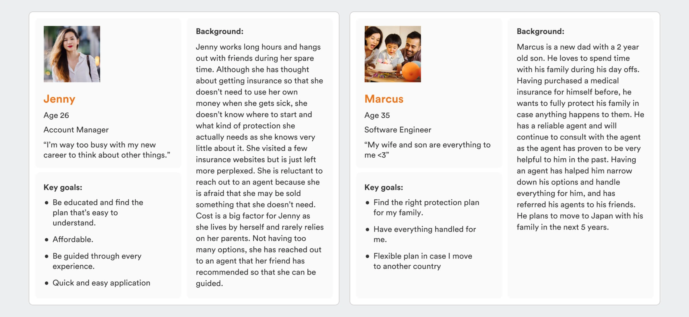
After conducting the interviews, we synthesized our findings and find any patterns. We narrowed down our findings into 2 personas, "Jenny" and "Marcus". Jenny is a young busy adult who wants to be guided when buying insurance. She needs something quick and easy as insurance is probably the last thing on her mind. Marcus is a father to a newborn looking for the right protection to insure his whole family.
Identifying red routes
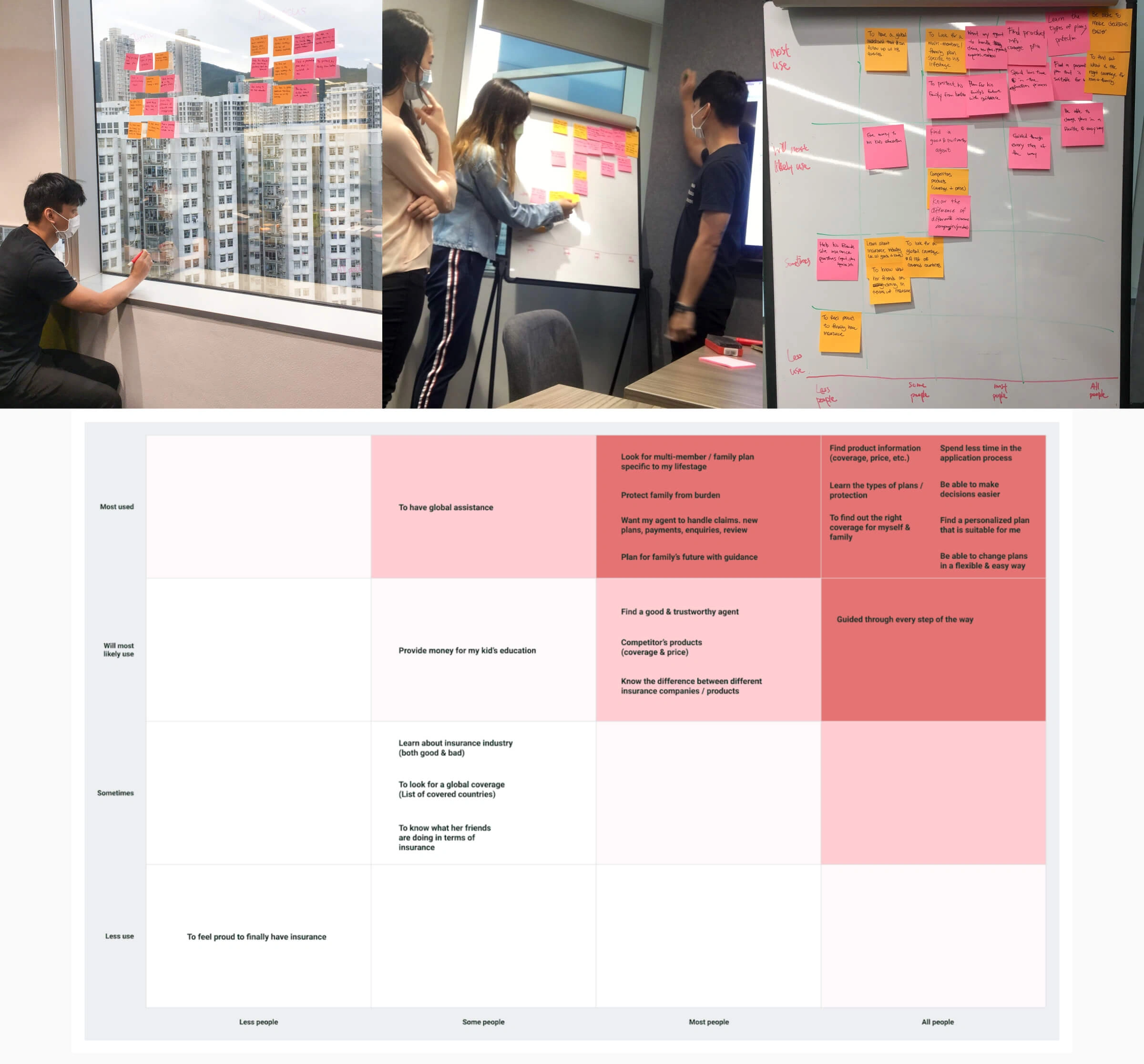
We then brainstormed 10 red routes that describe our persona's key tasks when using our platform and put them on sticky notes. With those same sticky notes, we then prioritized those red routes to see which ones would bring the most value to most people, and vice versa. Putting them on a matrix helps visualize the foundational user journeys that make our platform valuable and to help capture the important actions that our users want to take. These will be the building blocks to our design.
Ideation
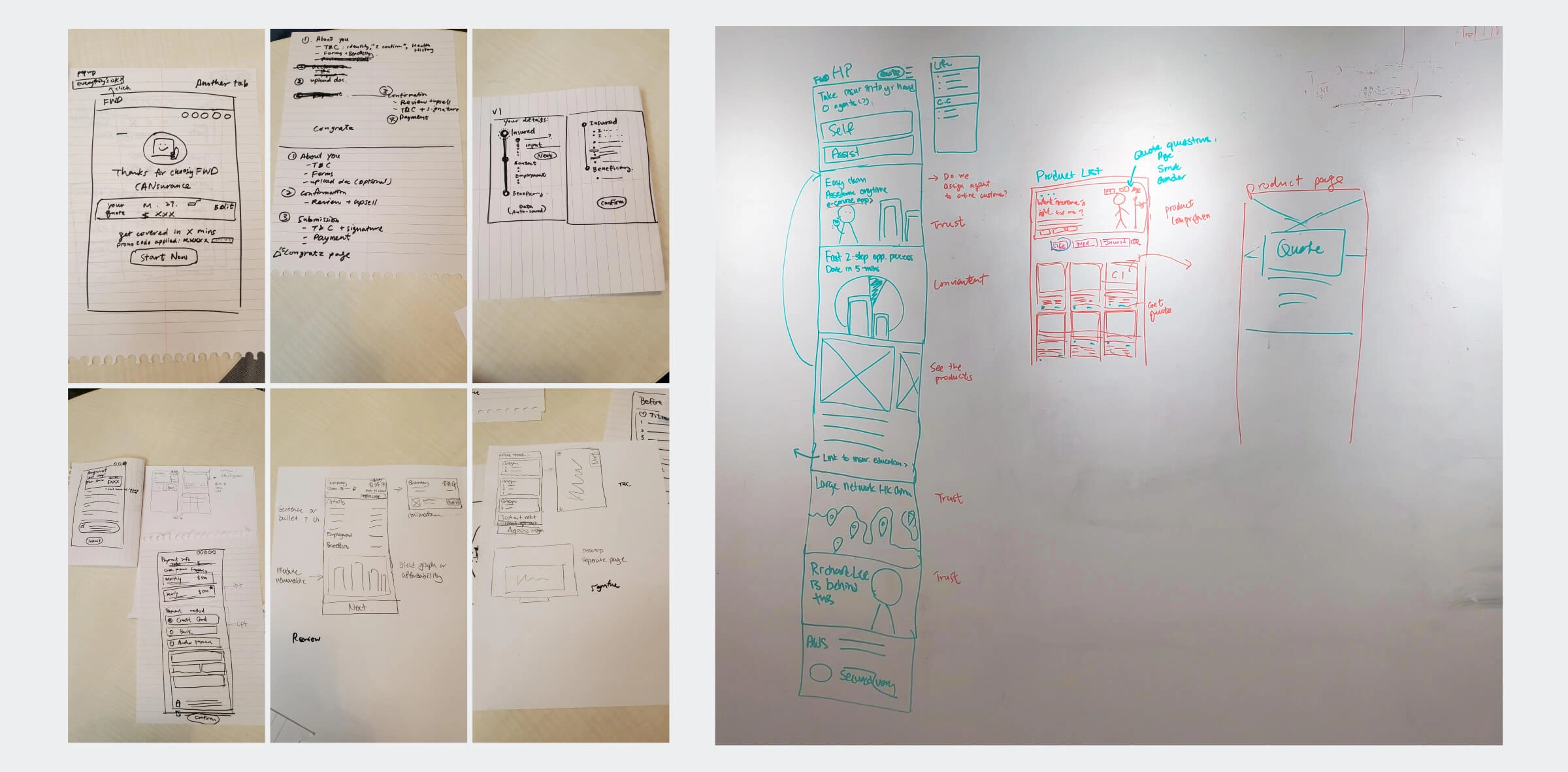
Now that we've identified the red routes, it's time to ideate a solution. We first each sketched out key screens on paper with only having a minute or two to sketch each screen. After each round, we talked about our ideas and solutions and decided on the final solution to bring to the prototype. This rapid sketching approach helps us generate and share ideas and make decisions on the spot.
Conclusion
Unfortunately, this is where my role and responsibilites end. I had to be pulled out from this project as I was required to help out on another project in FWD. Nevertheless I still want to show you guys the process and what me and 2 other designers have done.
Collaboration was definitely key especially during brainstorming and sketching sessions. Design Thinking really helped to shape the workshops and discussions while keeping our "north star" user-centric. Facilitating the intial phase of the design helped me realize where and how I can optimize the design processes in the future.