SME Connect
Insurance for Small & Medium Enterprises
Overview
FWD's SME Connect aims to have an end-to-end paperless sales journey for small and medium enterprises (corporate care). As brokers/partners, they have to rely on the internal sales support team to generate quotations manually for their prospects. An agent will have to go through multiple touchpoints with the customers and back office team before an SME policy can be issued. Small and medium businesses like startups may also find the traditional way of getting their employees insured long and tedious.
Goal
There are 3 main goals for this project:
- Automate the end-to-end journey for agents, partners and brokers. From quotation creation, closing a sale, to managing customers.
- Enable self-service purchase journey end-to-end to customers.
- The platform should be modular, reusable and scalable as this will be rolled out to several countries in the future, and customers will be using this platform as well.
My role
As the sole designer for this project, I was responsible for designing the entire UX and UI, capturing requirements from stakeholders with big help from my PM, presenting prototype demos to the team, supporting my PM in running remote user testing sessions with agents, and supporting my PM with design handoff and communication with developers.

Designing the UI & UX
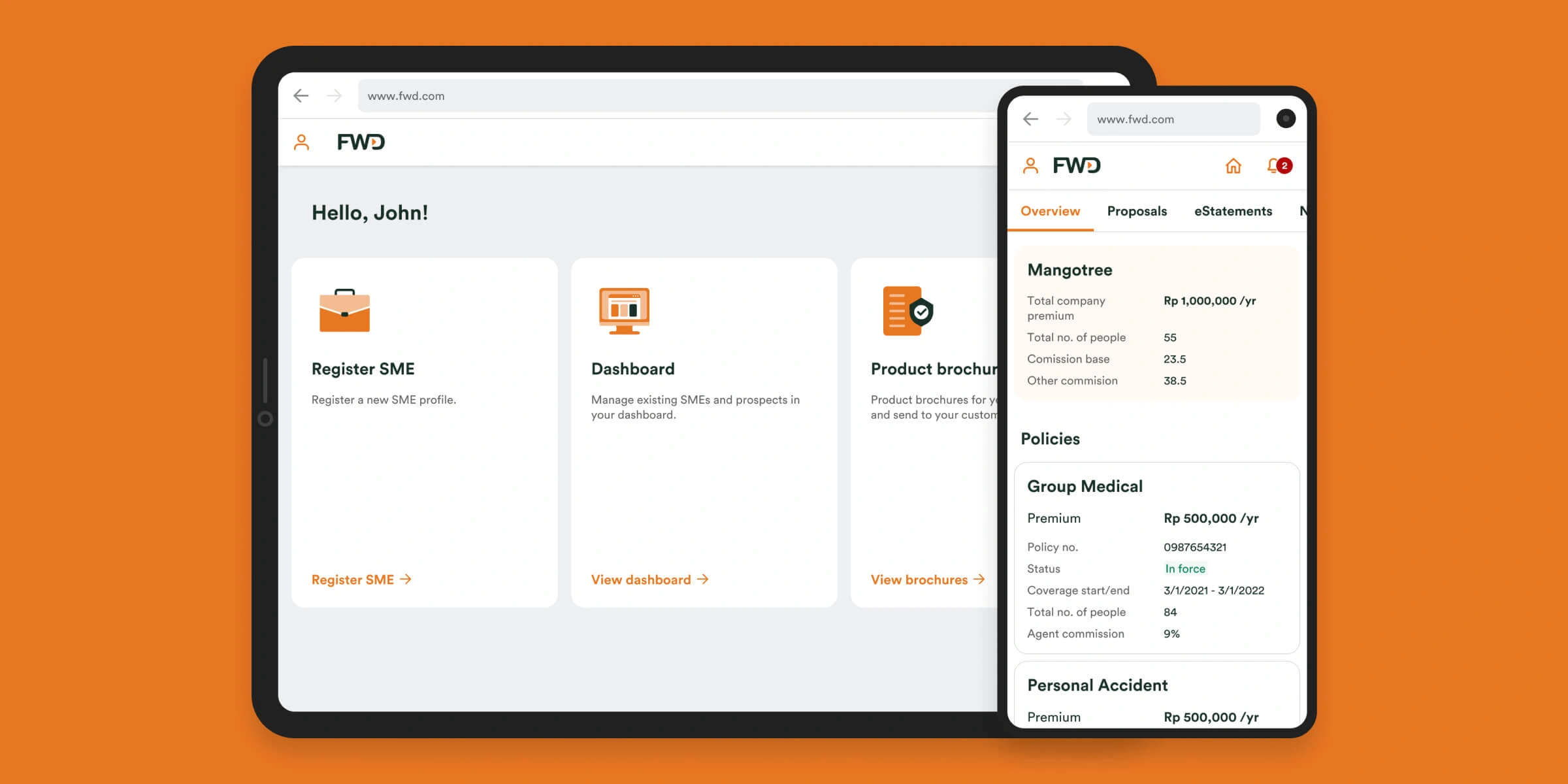
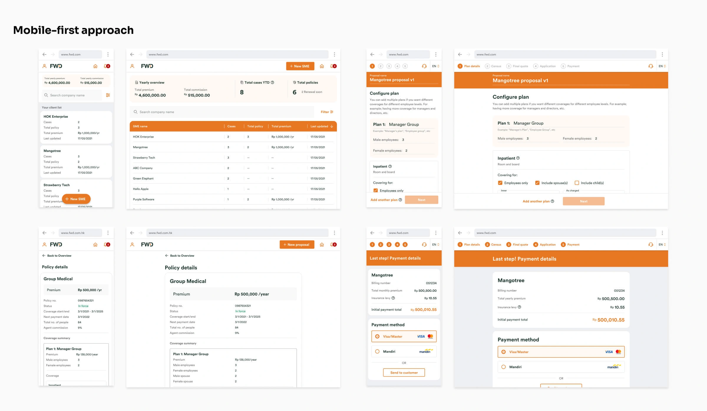
SME Connect will be used by agents and customers. Agents should be able to manage their prospects and create proposals and quotations. Both agents and customers should be able to purchase a policy and manage their active policies with some sort of dashboard/portal for desktop, tablet and mobile. SME Conenct will also be rolled out to other countries. Different countries will have different insurance products and regulatory compliances. This raises a challenge where the entire journey and UI should not deviate too much no matter the type of user or country. It needs to be designed in a way that's modular, reusable and scalable.
I have taken a mobile-first design approach for this project as it's easier to scale up than to scale down.

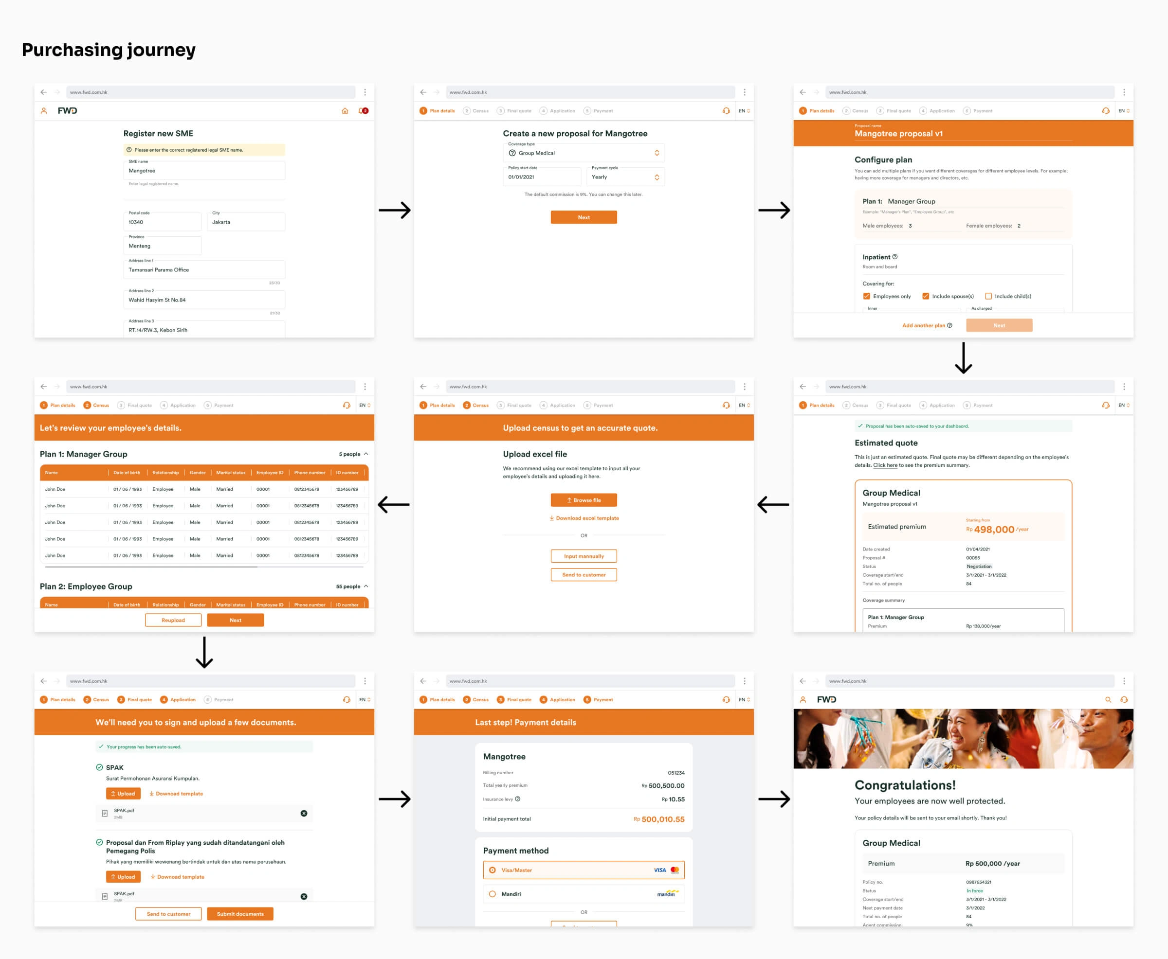
The purchasing journey
We first tried to understand the entire purchasing journey and identified touchpoints where we can improve efficiency and go paperless. From generating a quote, to application, to payment, and everything in between. We've made a few prototypes to show the stakeholders and agents where there may be limitations and regulatory restrictions in the flow, and we iterated the design based on their feedback. We also had to make sure that the purchasing journey is able to cater to different insurance products like Life, Accident, Medical, etc, and can also cater to different country's regulations.

Key differentiator
One of the key differentiators SME Connect have from competitors, aside from going 100% paperless, is that an SME can have multiple coverage plans under 1 policy. An example would be; Managers can have more coverage and include their spouse and children, where as employees can have less coverage and may not include their children. Rather than having them as separate policies, this can be configured so that the customer is purchasing 1 policy that has multiple coverage plans under it.
The dashboard
This is where agents can manage their prospects and customers. On the other hand, customers will also be able to see some parts of the dashboard that is relevant to them. The dashboard is designed in a modular way where we can hide information that customers don't need to see, while still having an intuitive UX and reusing the same components.
There's also a simple note-taking feature for agents for them to quickly jot down notes in one place.
Conclusion
After doing remote user tests with agents from other countries (with help from my PM) and iterating on the designs, it was finally ready for handoff to developers.
There were certainly a lot of challenges working on this project. One of the main challenges was to design the entire UI and UX in a way that's intuitive for customers, but at the same time efficient for agents to use, while using the same UI components, while also making it responsive for mobile. By designing it in this way, we have achieved better efficiency to accelerate our rollouts and cost savings to markets.
The entire journey from generating a quotation, application submission, to payment has been reduced from multiple days to just under an hour. Furthermore, it's also self-service for customers.
The first country to roll out SME Connect will be Indonesia, followed by Thailand, and more.