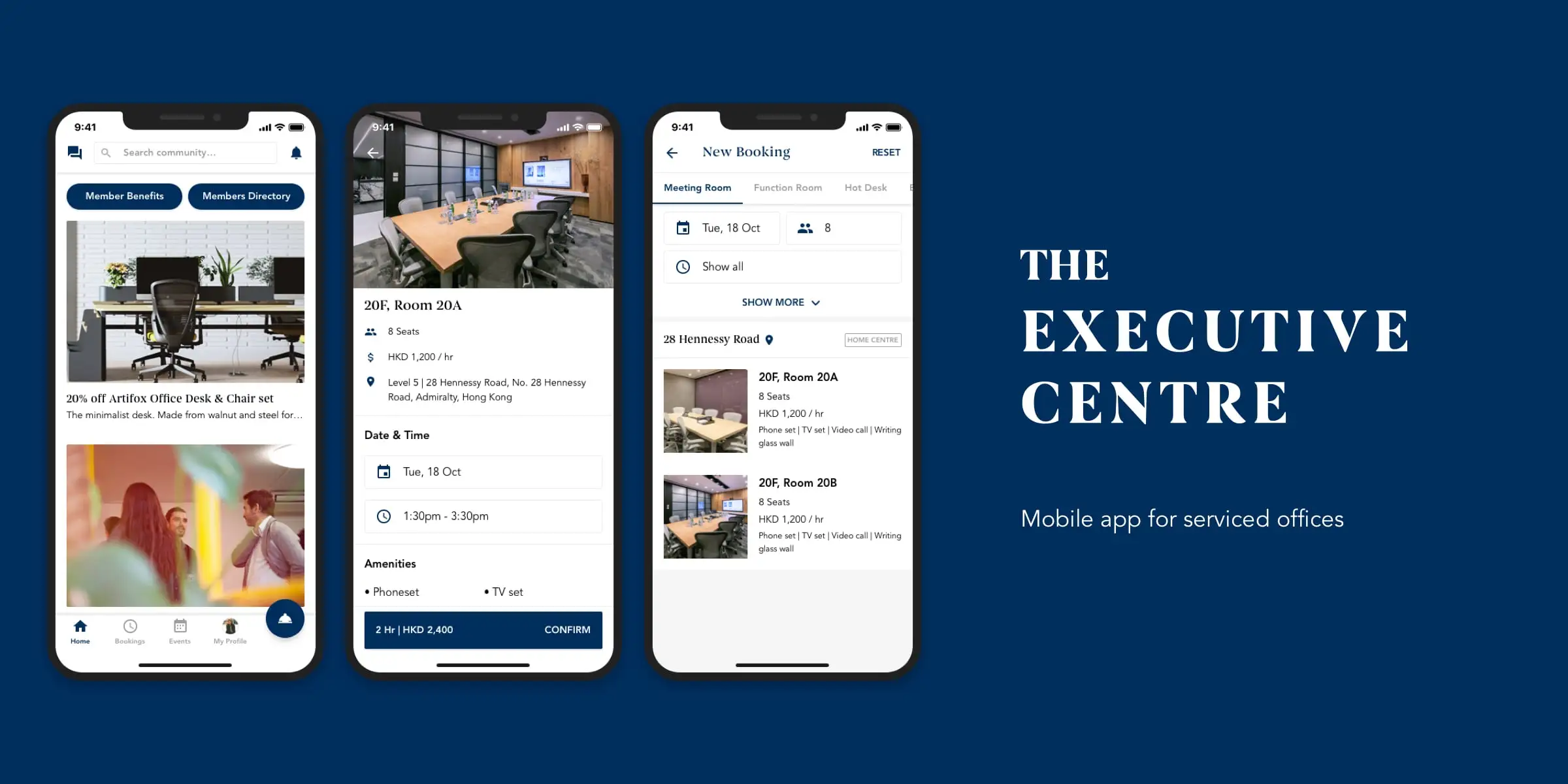
The Executive Centre
Mobile app for serviced offices
Overview
The Executive Centre is the leading provider of premium flexible workspace in Asia-Pacific. What sets TEC apart are the premium quality of its office environments and its exceptional customer service. The company is often described as the office space equivalent of an airline’s first-class section.
Goal
TEC needs a fresh revamp of their existing mobile app as the current state of the app's UI/UX is a "Frankenstein" of different features and components that may not add value to the overall experience. The goal of the project is to redesign the experience hollistically by making the app functional and intuitive for users to use fundamental features. New features will be added later on as the app evolves, so the app needs to be designed in a way that's scalable and maintainable.
My role
I was hired as a contractor for 5 weeks to lead the design phase of the project. My role was to research, ideate, design the UI/UX, facilitate workshops, and do the design handoff to developers.

The process
The project took 5 weeks to complete. The design process for this project is an iterative process that takes bits and pieces from the Design Thinking and Design Sprint processes; Identifying red routes, wireframing, low and high fidelity prototyping, heuristic evaluation, 3 rounds of user testing and design iterations, and developer handoff.
After identifying the red routes, we first designed the wireframes and prototypes, and did 1 round of heuristic evaluation before we tested it with users.
Heuristic evaluation
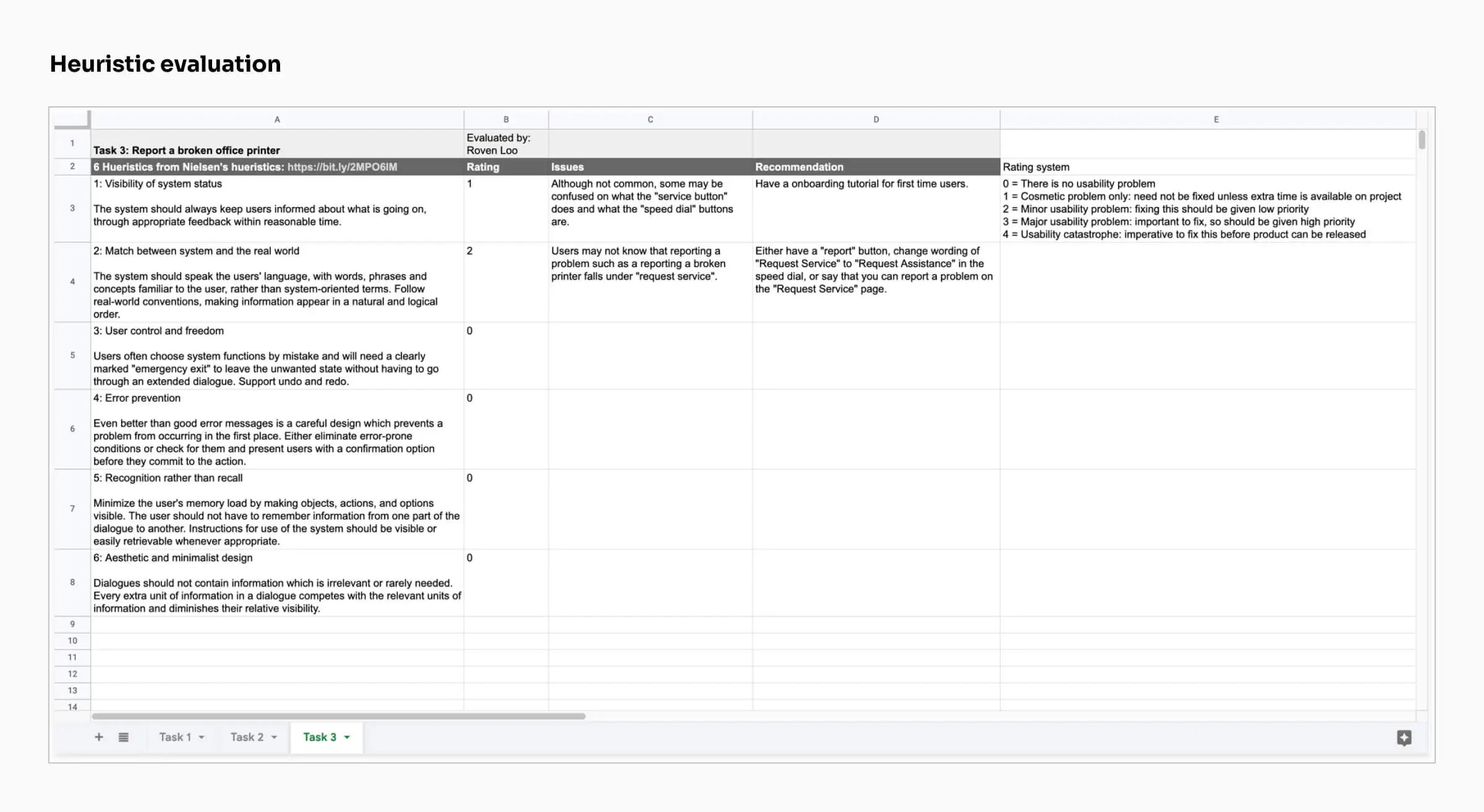
After the first prototype was done, heuristic evaluation was done before user testing. This is a usability inspection method that helps to identify usability problems in the UI and judge its compliance with recognized usabilty principles. I decided to add this step to identify potential usability problems early on to help minimize the iterations after each round of user testing, due to time constraints and resources. The heurisitcs are based on the Nielsen Norman Group's "10 Usability Heuristics for User Interface Design".
Validating the designs
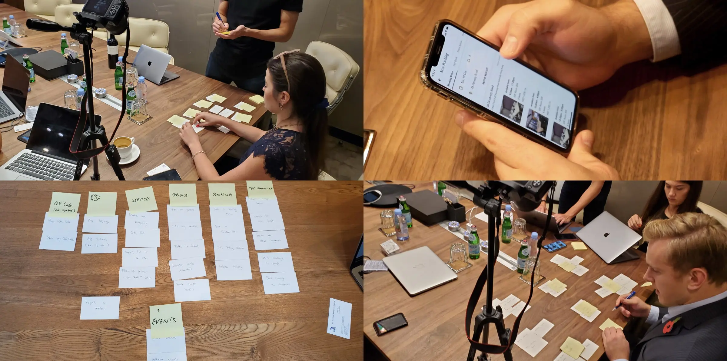
We then scheduled a few workshops where we got participants to test our prototype while we recorded them. As the facilitator, I always try to record the participants and review the videos later. This is so that we can focus more on the participants and tasks at hand during these sessions, and take notes later when reviewing the videos so that we don't miss anything. Rather than doing both simultaneously.
We first asked the participants some questions to get some qualitative data. Then we tested our prototype with them. And then we did card sorting to see how they group features in the app that make sense to them. This gave us some interesting insights on how we can improve the app's navigation.
We've done 3 rounds of user testing in total, with each round having 4-5 participants.
Designing the UI
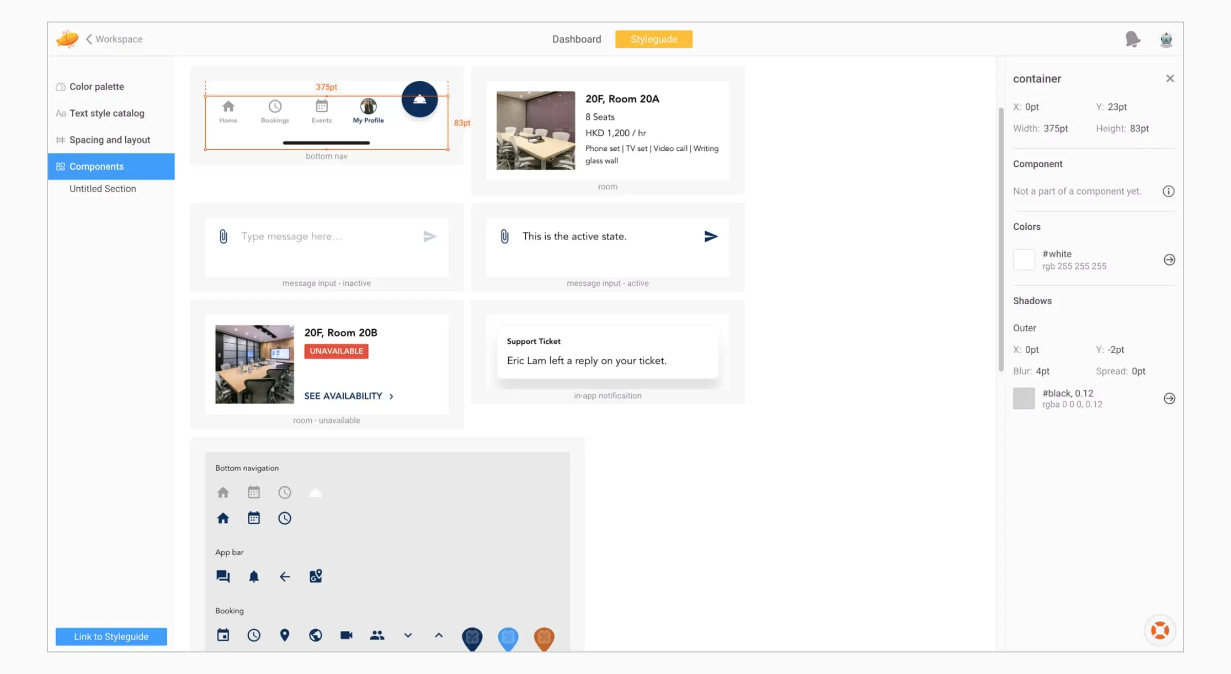
I created TEC's design system using Material Design as a foundation so that the UI is modular, maintainable and scalable for the frontend, as well as making it seamless to implement any features in the future. It also streamlines collaboration between me and the developers for a more consistent and unified UI and UX. Material Design can also help TEC's developers build and launch new features quickly without sacrificing the consistency of the UI and UX.
App screens
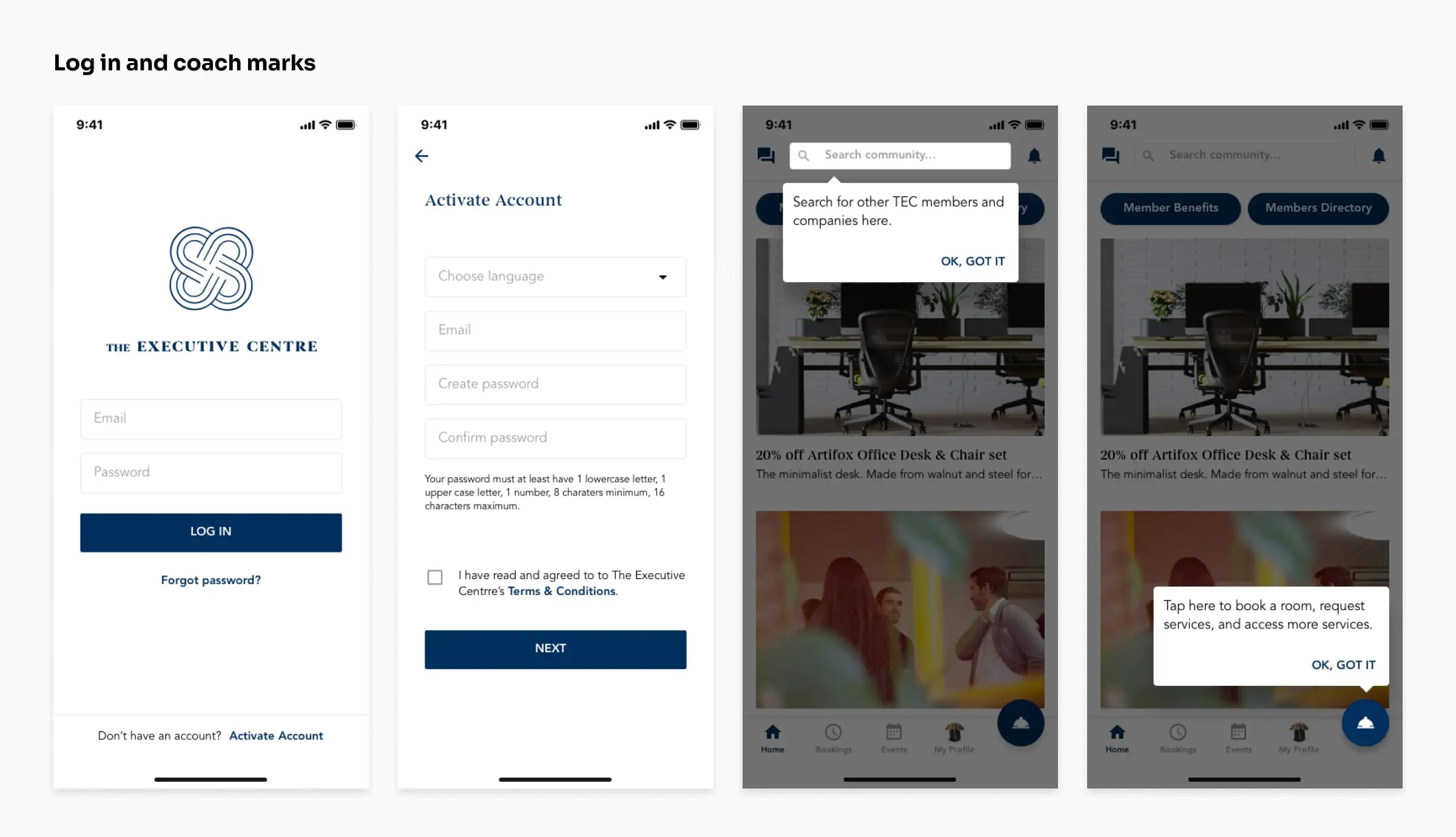
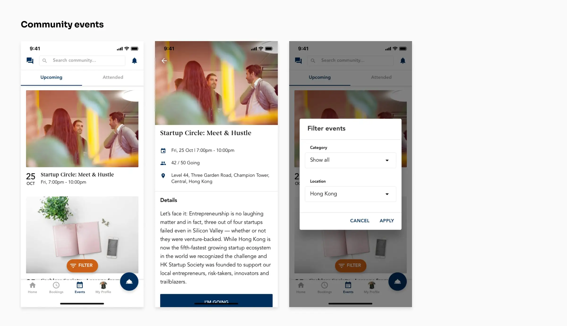
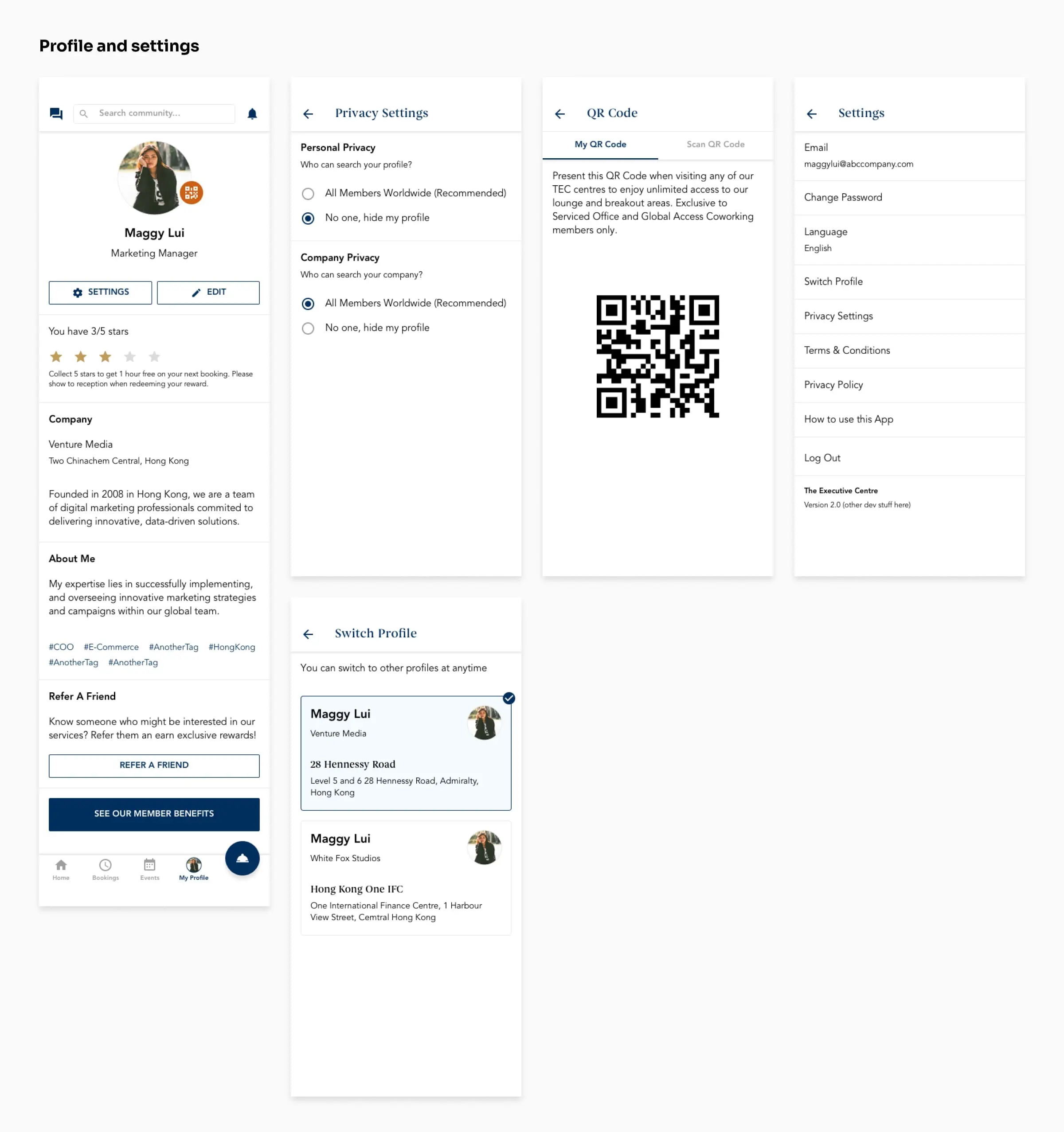
The app's features are; Booking meeting rooms and event spaces, member directory, help desk ticketing system, concierge service, joining events, F&B ordering, member benefits, and more. The floating action button on the bottom navigation has a "speed dial" UI pattern so that users can easily access fundimental TEC services. The "speed dial" UI pattern also makes it modular to add new features to the app.
Conclusion
At the time when I was helping out on this project, TEC did not have a full-time UI/UX designer (I'm not sure if they do now). So I've designed the UI and UX in a way where it's easily scalable as the app gets more features, even without a designer. That was one of the things that I always kept in mind.
It was a great experience working on this project, as well as the 2 PMs that I got to work with, Claire and Daryl!