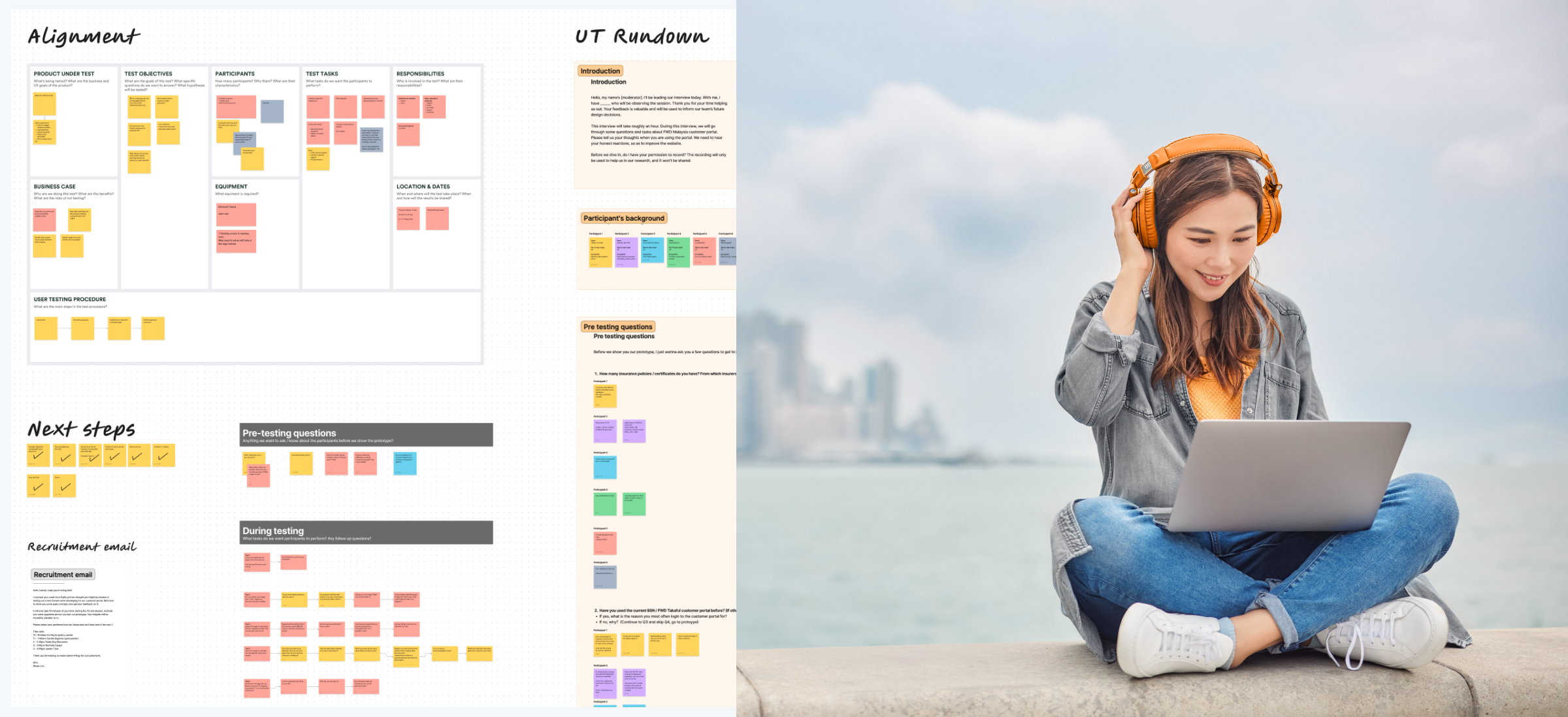
FWD - Customer Portal
Guiding the team through impactful user testing
Overview
The Customer Portal team has designed a web application for different markets enabling customers to manage their policies online, starting with Philippines and Malaysia. Despite the team’s lack of experience in user testing, they were eager to evaluate their prototype’s effectiveness. For this case study, I’d like to focus more on the process itself and how I typically conduct user tests, rather than the intricate details.
Goal
The objective was to assess the application’s navigation, intuitiveness for completing tasks under various scenarios, and to identify usability concerns, preferences, and suggestions from the users, all done remotely across 2 markets.
My role
I was appointed by my manager to lead the user testing initiative for the Customer Portal team. My role was coordinating the team’s goals and objectives, recruiting participants for Malaysia and Philippines, create test scenarios, facilitate the user testing sessions remotely, data analysis and insight generation, and report my findings to the team and stakeholders across markets. Additionally, I provided mentorship to my fellow teammates throughout this initiative.
Aligning with the team
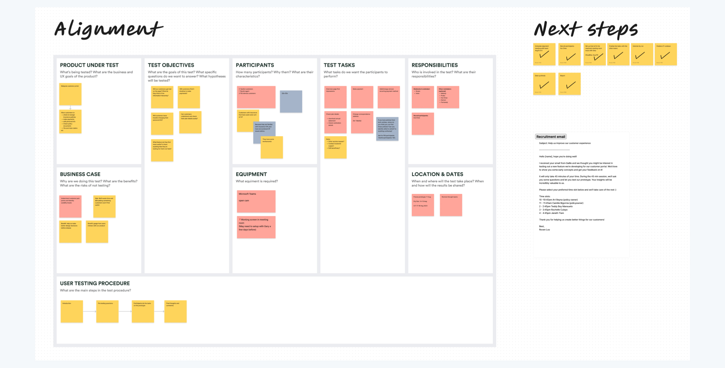
Throughout my experience as a UX/UI designer, I've realized the significance of team alignment. Co-creation workshops are an excellent method to achieve this. It leverages collective expertise and perspectives, and fosters a sense of ownership and buy-in amongst the team.
There are many ways to go about doing an alignment workshop. I opted for a user testing canvas for its visual clarity and ease of sharing with stakeholder and mangers, instead of a lengthy document. It also serves as a reference point, a “North Star”, guiding the team back to our aligned goals and objectives whenever needed.
Crafting test scenarios
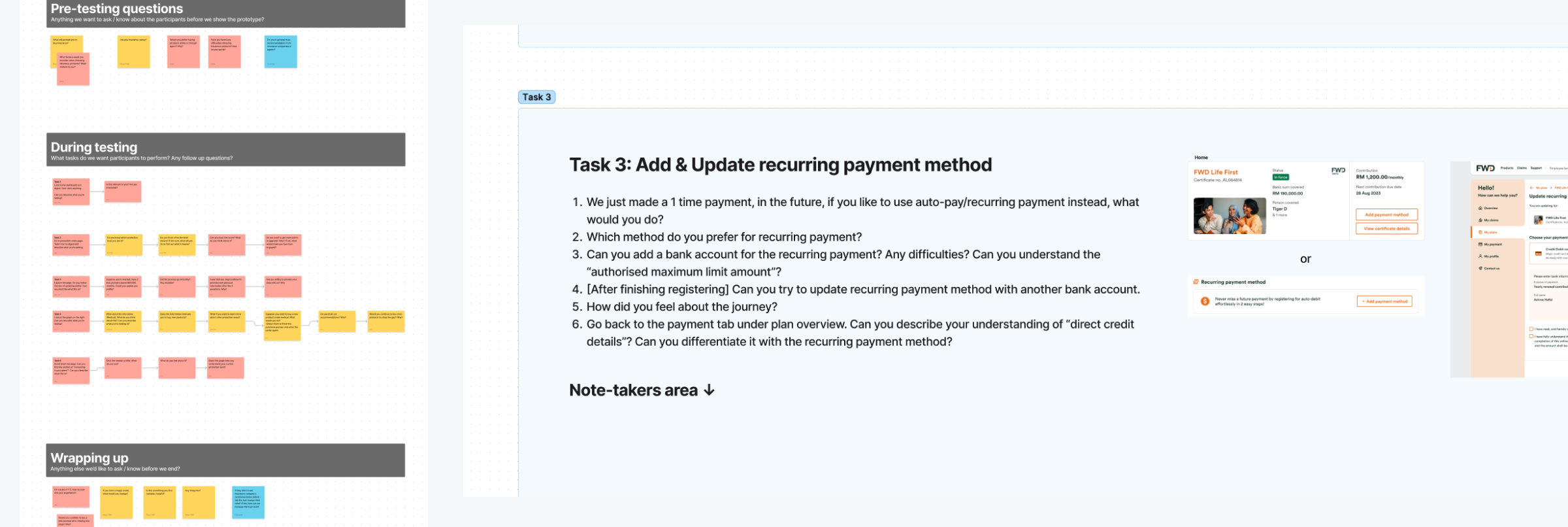
Following the alignment workshop, me and the other designers revisited the canvas to identify key questions we want to answer. We then developed a concise pre-testing questionnaire and meticulously crafted test scenarios for the targeted features, ensuring that we eliminate leading questions and minimize potential biases. The sequence of steps and the phrasing used when interacting with test participants were carefully considered. We settled on five test scenarios, optimized to fit within our one-hour session, ensuring a thorough evaluation without overwhelming the participants.
Recruiting participants
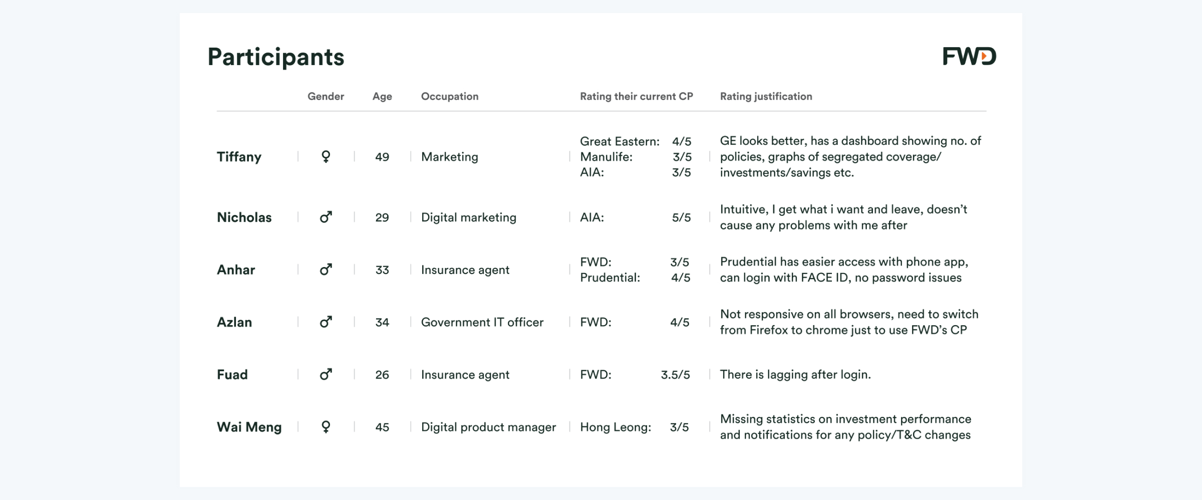
During our alignment workshop, a stakeholder took the initiative to recruit participants, streamlining our process. As designers focused on refining test scenarios and user test logistics, our stakeholder collaborated with other markets to engage local participants, ensuring no time was lost. We targeted individuals aged 20-50 with prior experience using insurance customer portals. These people are key because because they have the problems that we’re trying to solve, they know what they are dissatisfied with and have used alternative methods to solve their problems, which makes them ideal candidates to provide valuable insights. A super short screener survey was distributed to effectively select the most informative participants for our study.
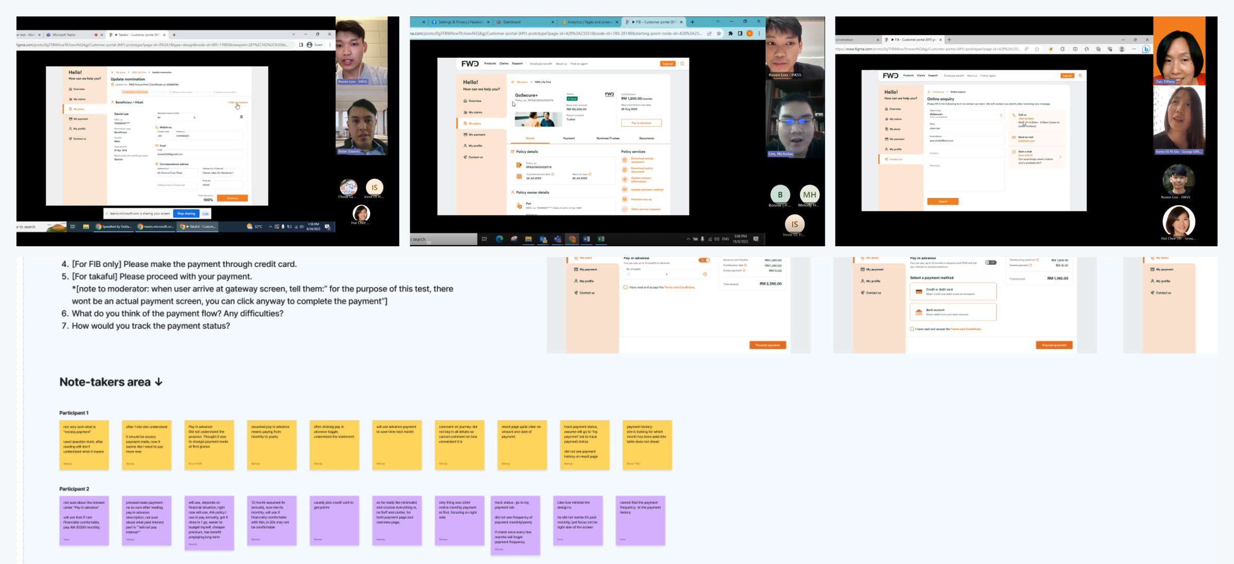
The user test
After a successful dry run with our team and recruiting six participants, we proceeded to test our prototype. I moderated most of the sessions, as well as giving the other designer a chance to moderate for the first time for her to learn as part of my mentoring. We alternated roles as moderators and note-takers during the remote sessions. Each test began with pre-testing questions to understand the participants’ experiences and beliefs, followed by testing the prototype to identify usability issues and how they felt with the journeys, and concluded with wrap up questions to capture their overall impressions and suggestions. One thing I Iike to do is look for existing user habits and workarounds mentioned during the user test, as these often reveal opportunities for innovative enhancements to the user experience.
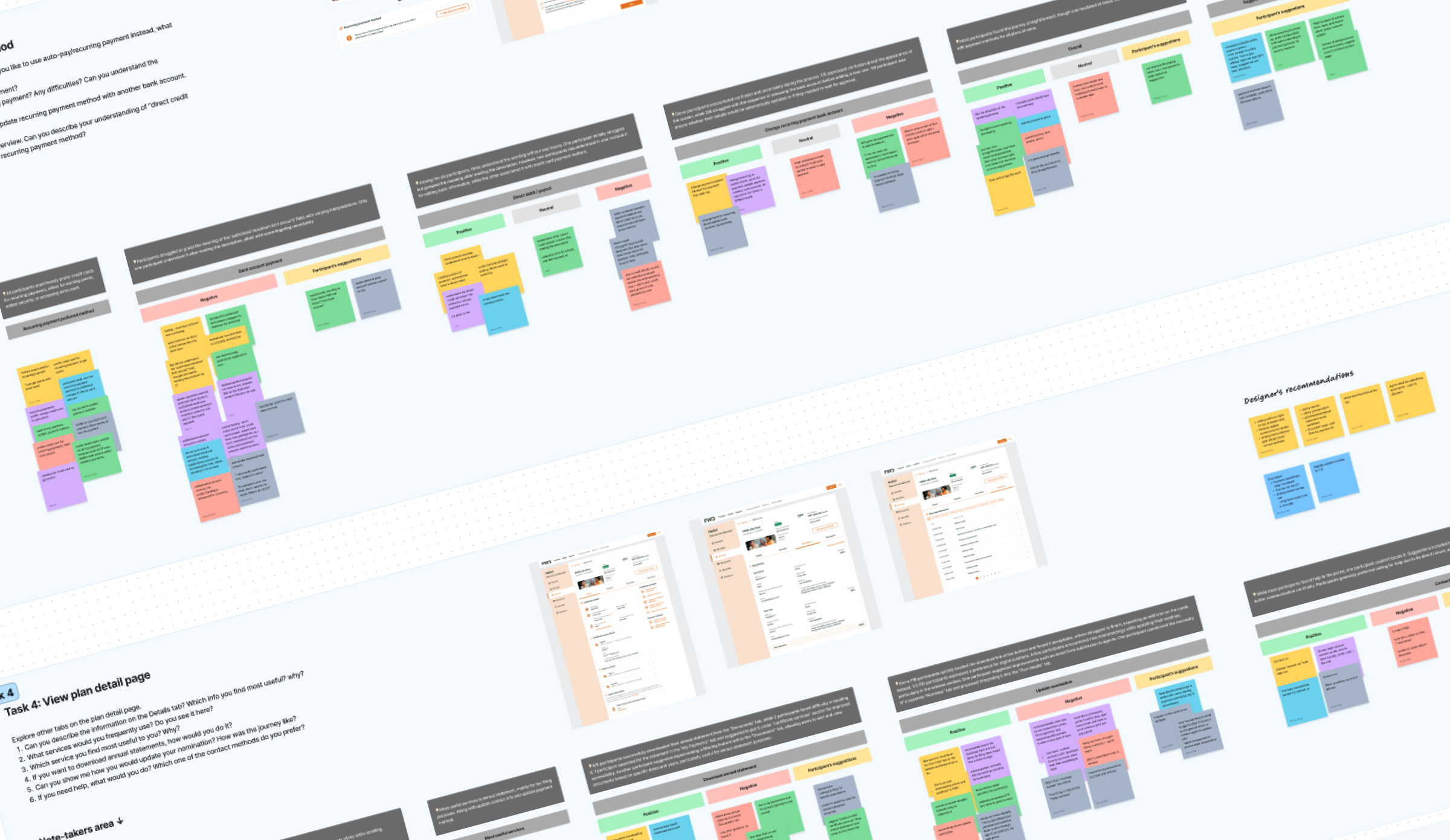
Analysing our data
Next, it’s time to analyse our data. I like to review the recorded sessions to see if I missed anything, noting down additional observations. We (the design team) then set up a time to go through our data where we start affinity mapping and generating insights. At times, the data may seem perplexing, but the alignment canvas serves as our compass, reminding us of our objectives and guiding our analysis. This reaffirms my preference for using such frameworks for team alignment. After generating insights, we documented our recommendations, prioritizing them based on their impact.
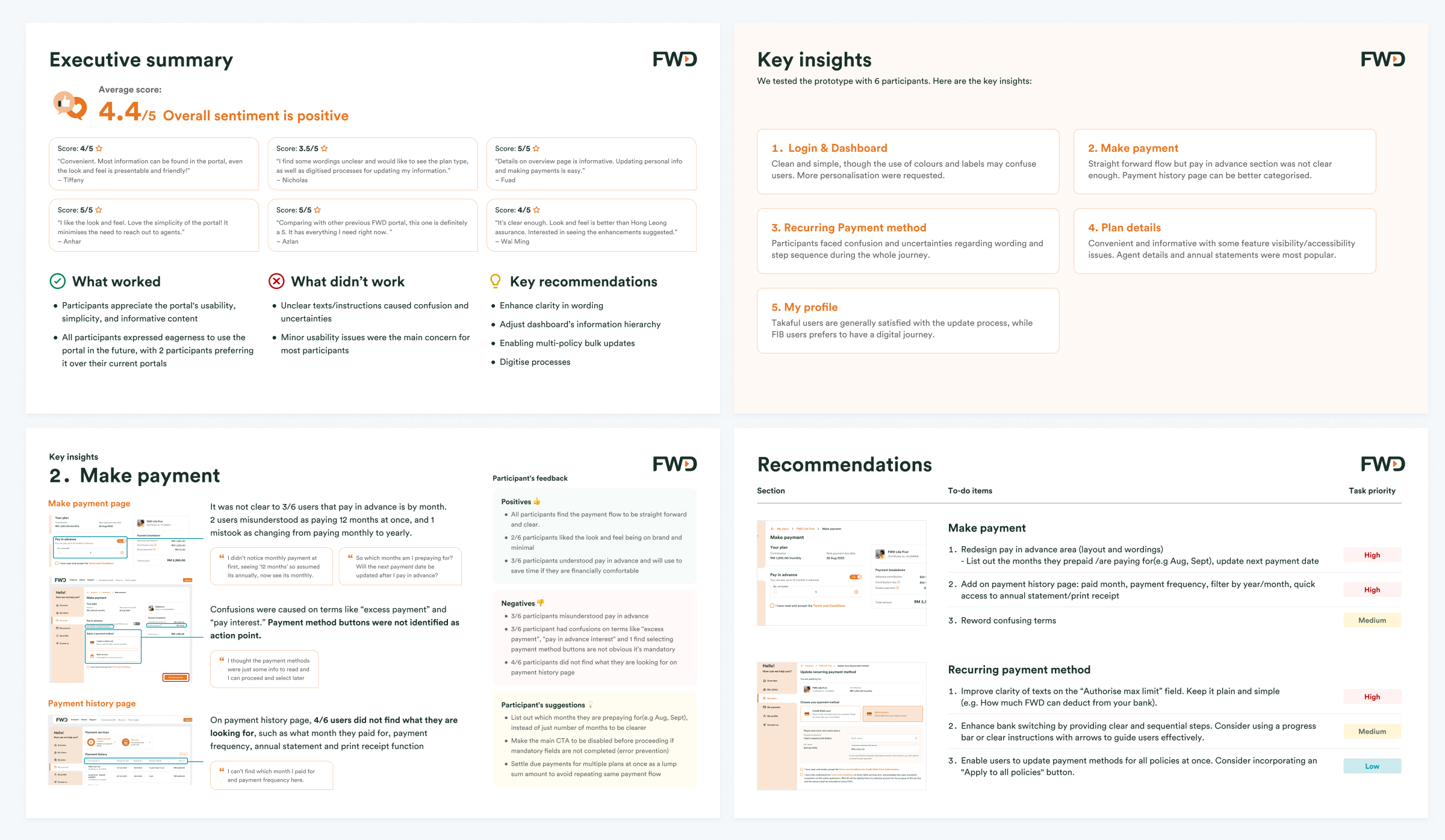
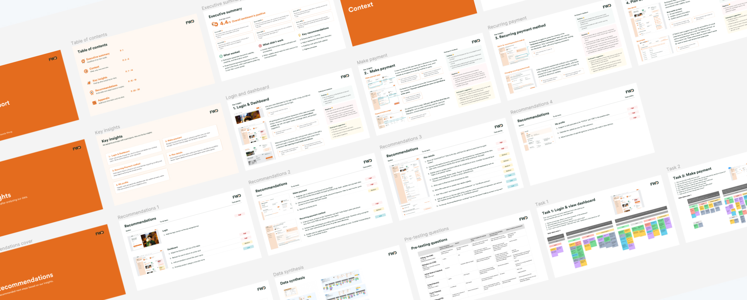
Report
After synthesising our data, I focused on preparing the user test report while the other designers iterated on the design based on our findings. My approach to preparing user test reports includes:
- Contextual introduction: Providing context (the what, why and how) before delving into the findings ensures alignment.
- Key insights: A dedicated page succinctly summarizing the main insights in just a few sentences.
- Test results: The intricate details of our findings, coupled with the participants' preferences, aversions, and recommendations.
- Participant quotes: Including actual participant quotes to underscore the authenticity of their experiences with our application.
- Recommendations: Slides showing recommendations to enhance the user experience.
- Appendix: An appendix to demonstrate our evidence-based methodologies.
- Executive summary: If necessary, a one-page executive summary as the first slide for busy managers and stakeholders, highlighting the essential information they need to know.
Conclusion
Through my leadership in this initiative, the findings from the user test sparked productive discussions and informed design decisions even after my departure from the team. This led to a significantly improved and more intuitive user experience for the Customer Portal. The collaborative nature of the user testing process fostered shared ownership and accountability within the team. Furthermore, this initiative has established a valuable framework for future user tests within the design teams. While each project is unique, this is my standard approach to conducting user tests.